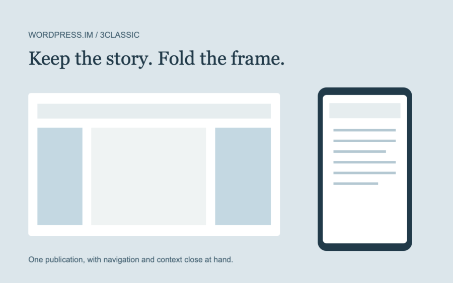
A three-column theme should not turn a phone into a miniature desktop. Shrinking the whole layout makes every part harder to use. 3classic instead changes which parts of the frame are visible at the same time.
The story stays in front
On desktop, the left sidebar, central stream and right sidebar share the page. On a small screen, reading takes the available width. The masthead menu opens below the title; the Menu and Sidebar controls provide separate access to the off-canvas panels.
These controls do different jobs. The header menu holds the main routes into the site. The left panel can include categories, archive links and a short introduction. The right panel can hold related context and links to the next useful thing.
Try it with this site
- Open the site on a narrow screen or resize a browser window.
- Open the header navigation and follow a page link.
- Use Menu to inspect the left sidebar, then close it.
- Use Sidebar to inspect the right panel.
- Return to a story and keep reading.
Content and menus are managed by WordPress. You do not need separate desktop and mobile copies of a post. The interface changes around one set of material.
For setup instructions, visit Getting Started.