A reading surface is a series of small agreements. The words need to be large enough to see. Lines need room to breathe. A heading should tell you that something has changed, and the next paragraph should begin where you expect it.
A measure for sustained reading
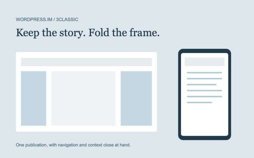
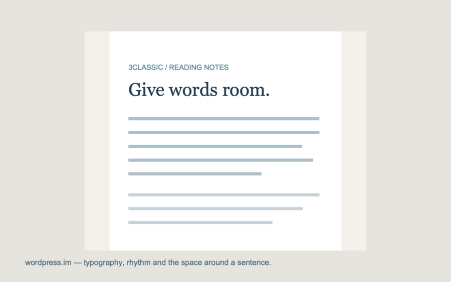
At the widest desktop layout, 3classic gives the central column a generous frame and keeps the text inside it. The writing does not stretch from one edge of a large display to the other. At narrower sizes the column adapts, while the relationship between headings and paragraphs remains familiar.
The theme uses a 17-pixel desktop paragraph size with a relaxed line height. That is a starting point for this design, not a claim that one number fits every language or reader. The meaningful question is whether you can keep reading without repeatedly finding your place.
A margin is part of the reading experience, even when nobody notices it.
Let different things have different weights
Sidebars carry shorter fragments, so their type is smaller and their headings quieter. Dates and categories provide orientation without becoming the loudest part of a story. A well-sized photograph can give a post a visual pause; it need not compete with every paragraph.
See these relationships together in the live style guide. This article and the accompanying diagram are original demonstration content by wordpress.im.